THE FREDERICK CENTER WEBSITE REDESIGN (prototype)
The Frederick Center website provides a wealth of resources and programs for the LGBTQ+ community in the Frederick, MD area, but users struggle to find the information they need and to register for programs, make donations, or volunteer, making users leave the site before completing their desired transactions.
UX/UI TEAM
Alexandria Daley, Michele Foshee, Karla Pérez
OUR SOLUTION
Why DOES THIS MATTER?
The LGBTQ+ community is a marginalized group that needs a stronger voice. Our goal is to continue to bring more attention and focus to the LGBTQ+ community to ensure they have access to the same resources and information as other groups. We strive to emphasize inclusivity, empathy, respect, and equal opportunities for the community.
INITIAL RESEARCH & ANALYSISBACK TO TOP
At the discovery phase of our project, we conducted both quantitative and qualitative research in the form of six user interviews, a survey, and multiple social media polls in order to better understand the needs and desires of our users.
What did we find?
- Our website has a user base that is not common for non-profit websites: our users are looking for resources and programs but are also likely to be our donors and volunteers.
- Our users generally live in the Frederick, MD area and like to join in activities with like-minded individuals.
- Our users are looking for support systems and resources that focus on their specific challenges.
- Our users want to be active participants in the community by volunteering for events.
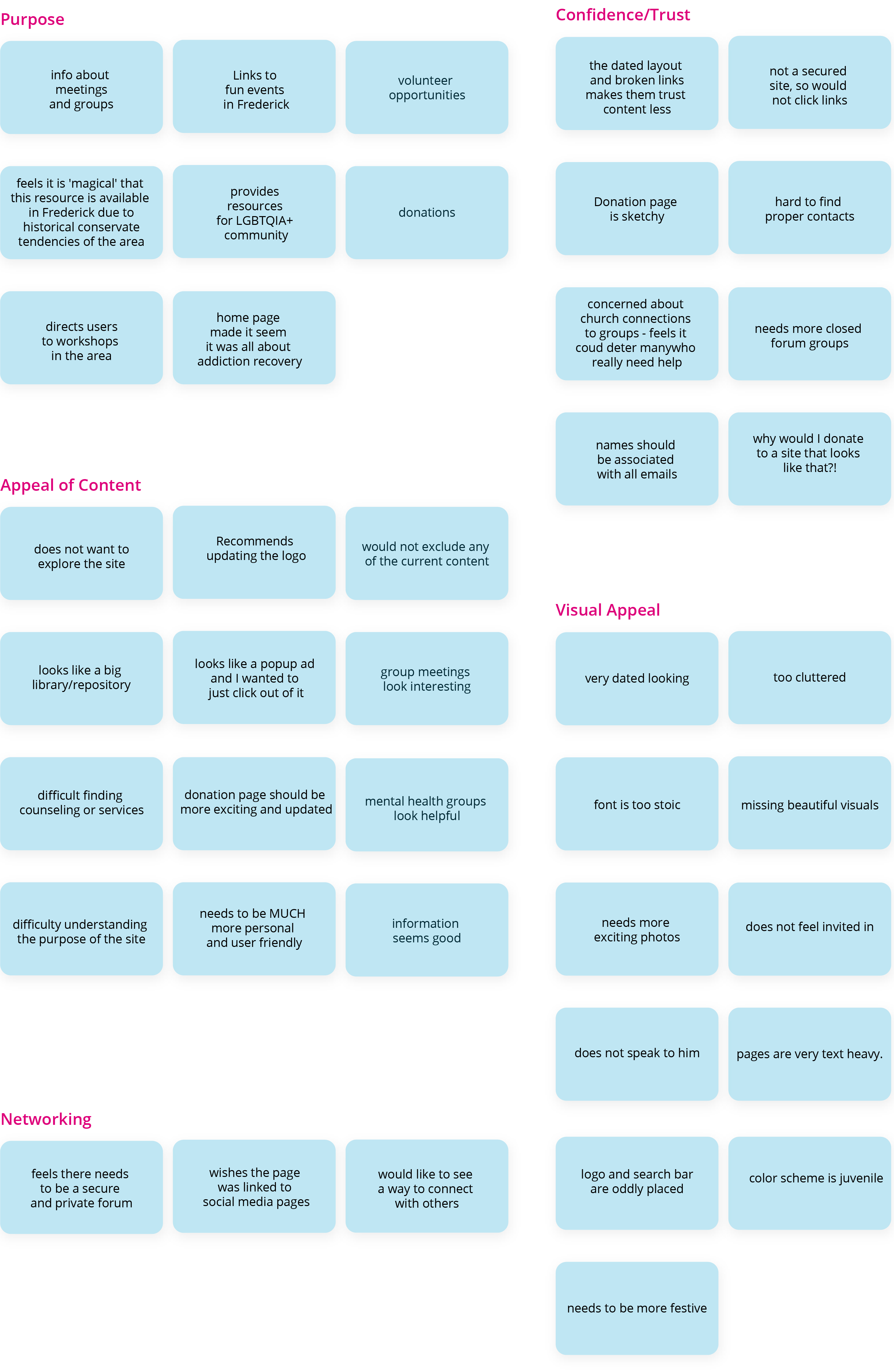
HEURISTIC EVALUATION
Additionally, we conducted a heuristic evaluation of the current website in order to discover usability problems impacting our users’ experience.
What could this site benefit from?
- Additional white space
- More consistency of content
- Clear purpose
- More concise language
- Functional links following clear conventions
- Intuitive navigation
COMPETITIVE ANALYSIS
What did we find?
- There are many national resources, but not significant competition at the hyper-local level, making our service more personalized and convenient to our Frederick community
- Competitors, including The DC Center for the LGBT Community, The Pride Center of Maryland, and The LGBT National Help Center offered a wealth of resources and information, but were not necessarily convenient or relevant to the users in our hyper-local area, giving us the opportunity to serve our community from within
DATA SYNTHESIS
We used a number of tools to synthesize the data, including: user journey, user scenario, interview insights, affinity diagram, and the I like, I wish, what if... method.
Affinity Diagram
I like, i wish, what if...
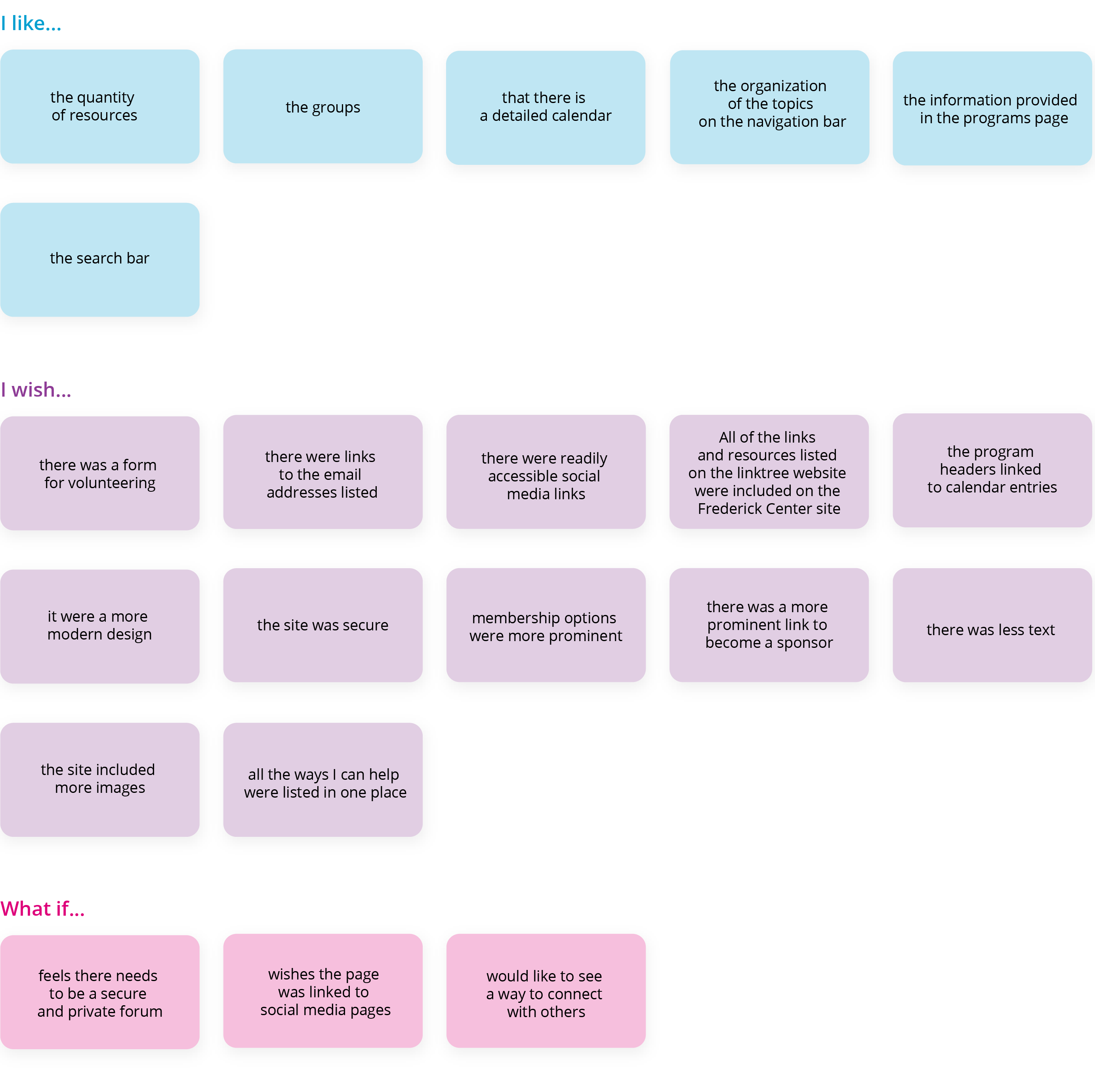
These tools allowed us to hone in on what this community truly needs and to prioritize how to best serve those needs.
We determined that the most pressing needs were:
- More intuitive and simplified navigation
- Buttons for quick actions such as donations and becoming a member
- A more aesthetically pleasing experience
- Ability to complete transactions directly through the website, rather than relying on email or mailed forms
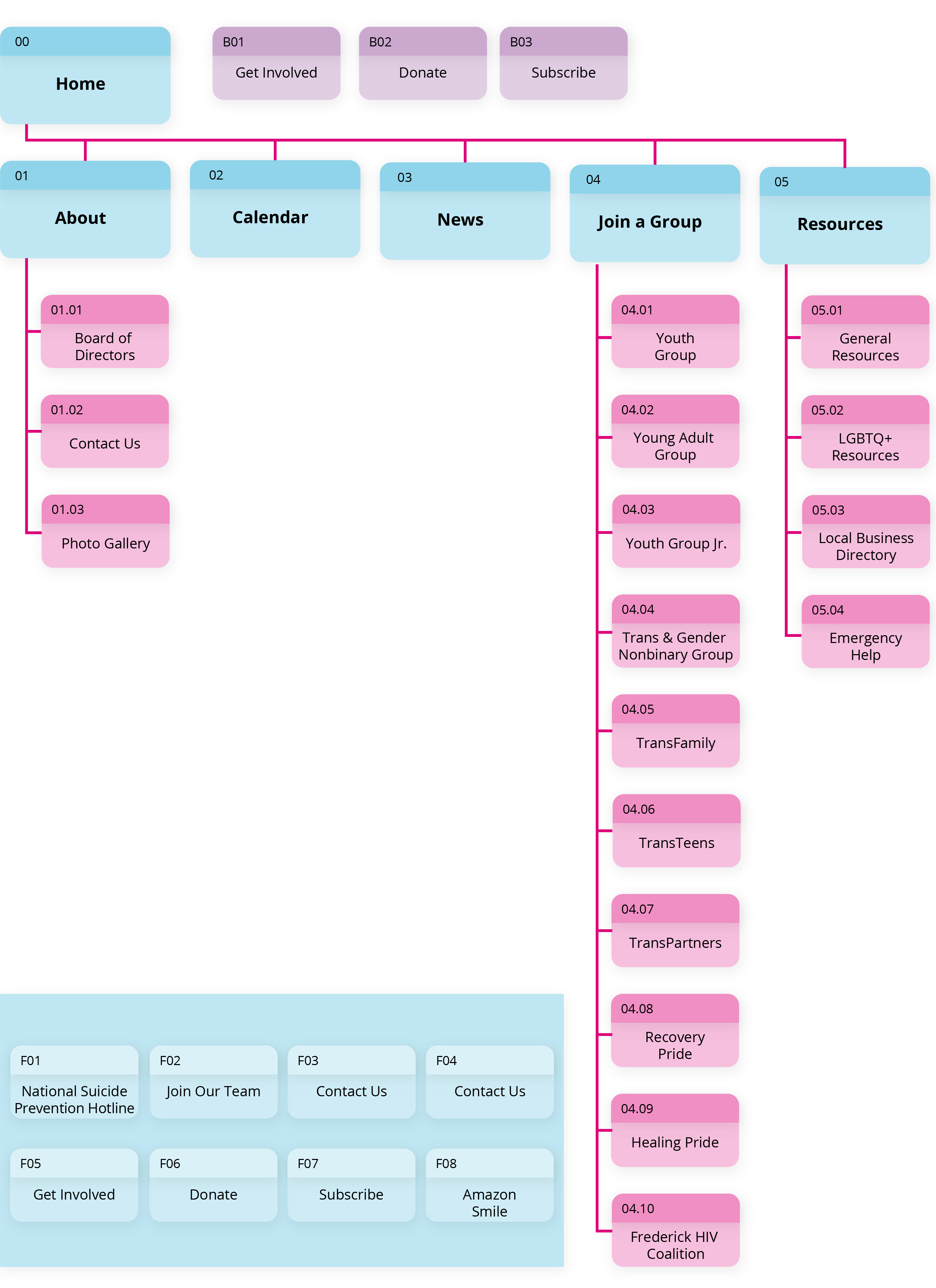
IDEATION & DISCOVERYBACK TO TOP
Our ideation started with a card sorting exercise to better understand the logic of the information architecture (IA) on the site. We discovered that there were a number of unnecessary redundancies in the current architecture which allowed us to streamline the navigation and create a new site map.
Site Map
SKETCHES & LO-FI PROTOTYPEBACK TO TOP
We started the design process with conceptual sketches for the layout of the site. We then compared the sketches to compile the strengths of each into one general concept, allowing us to create three low fidelity prototypes, which we tested with six users.
Sketches
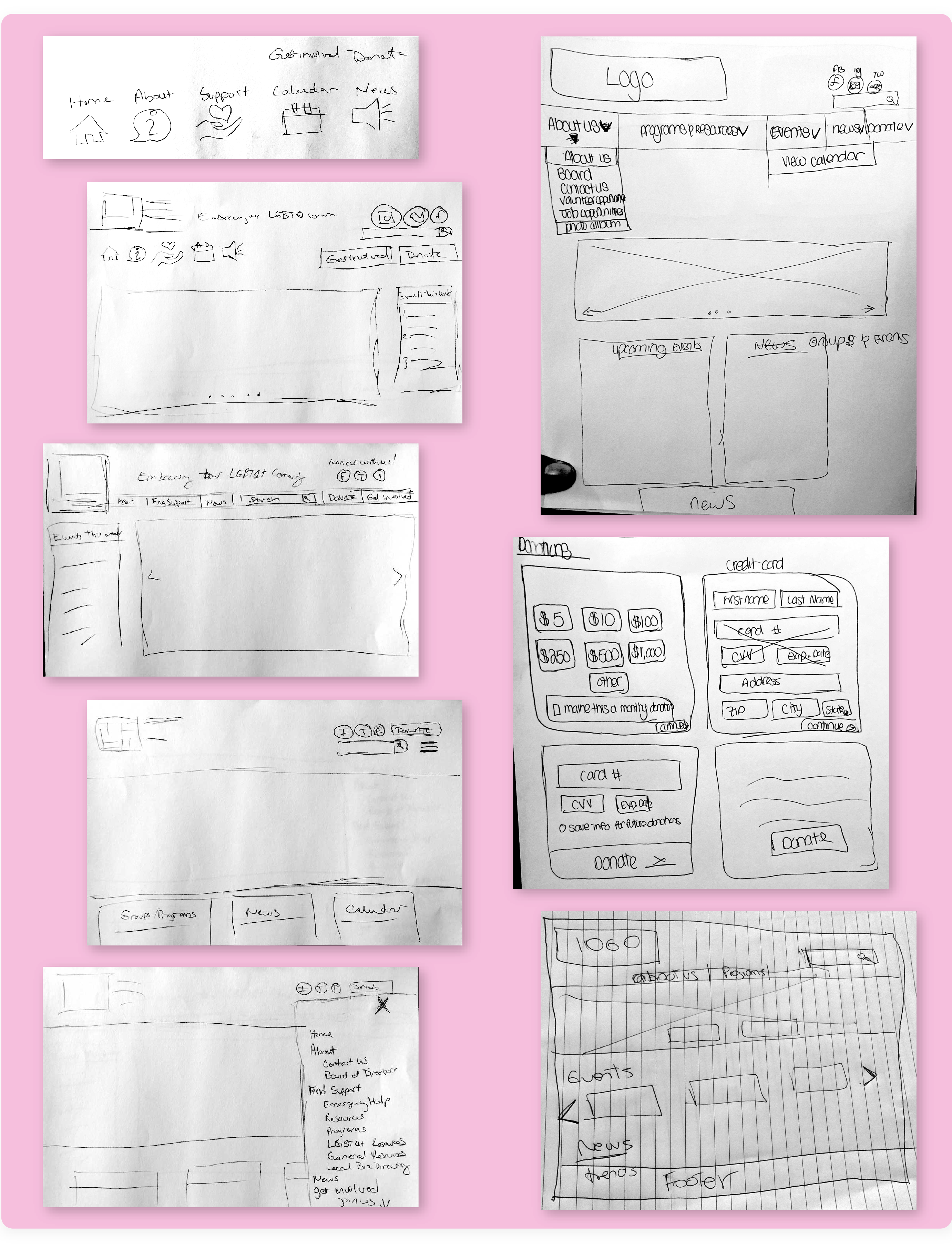
Revised Sketch
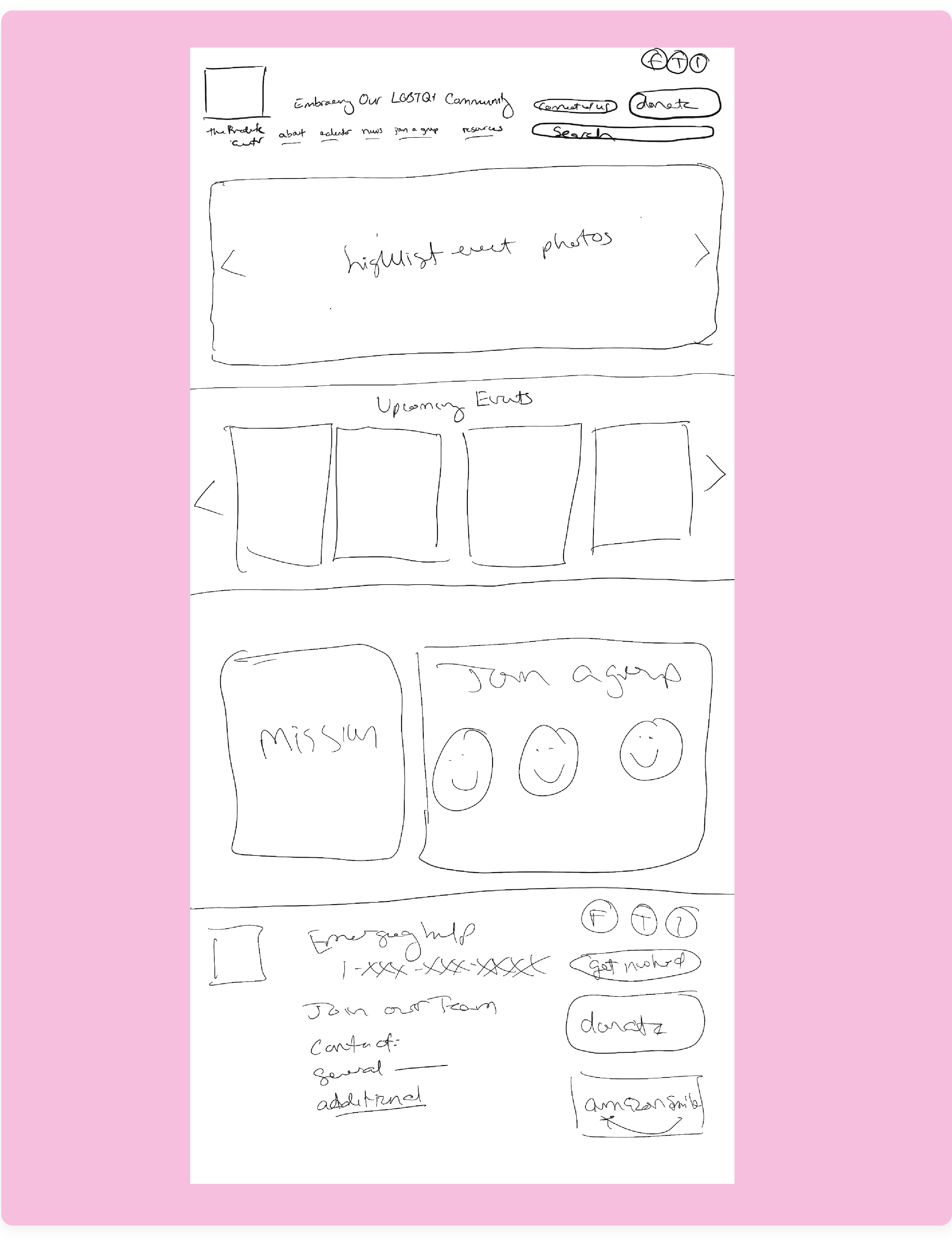
Low Fidelity Prototype
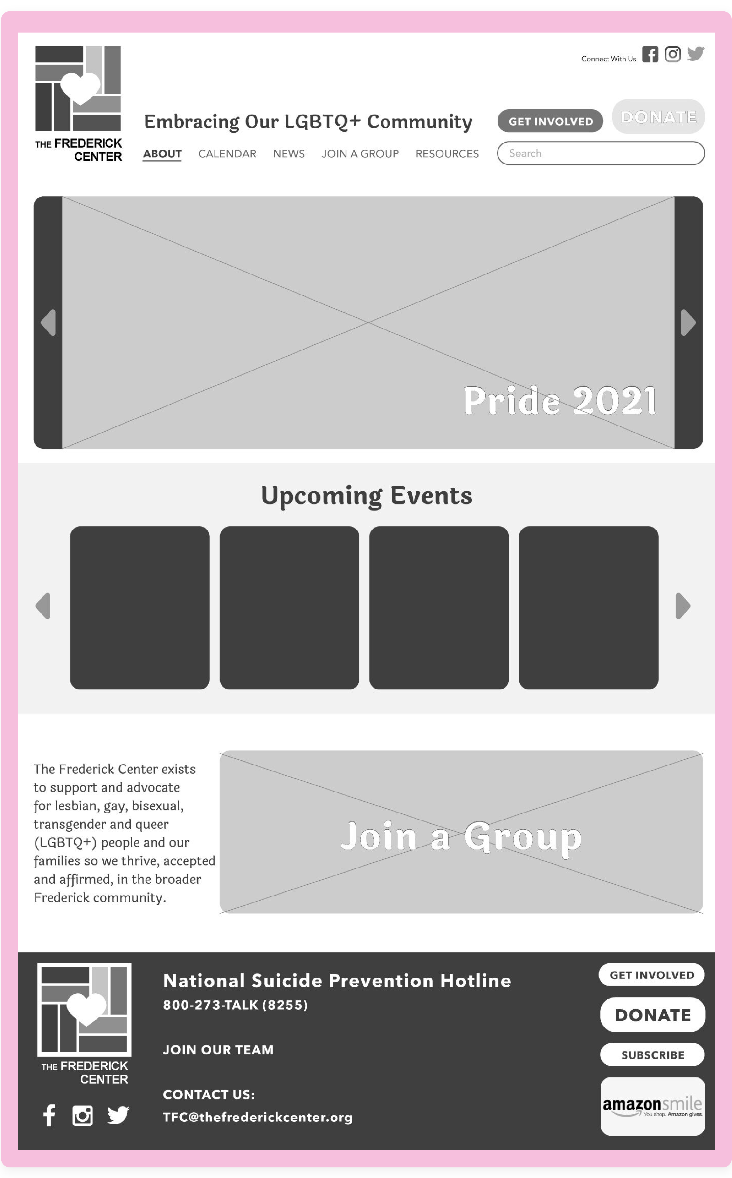
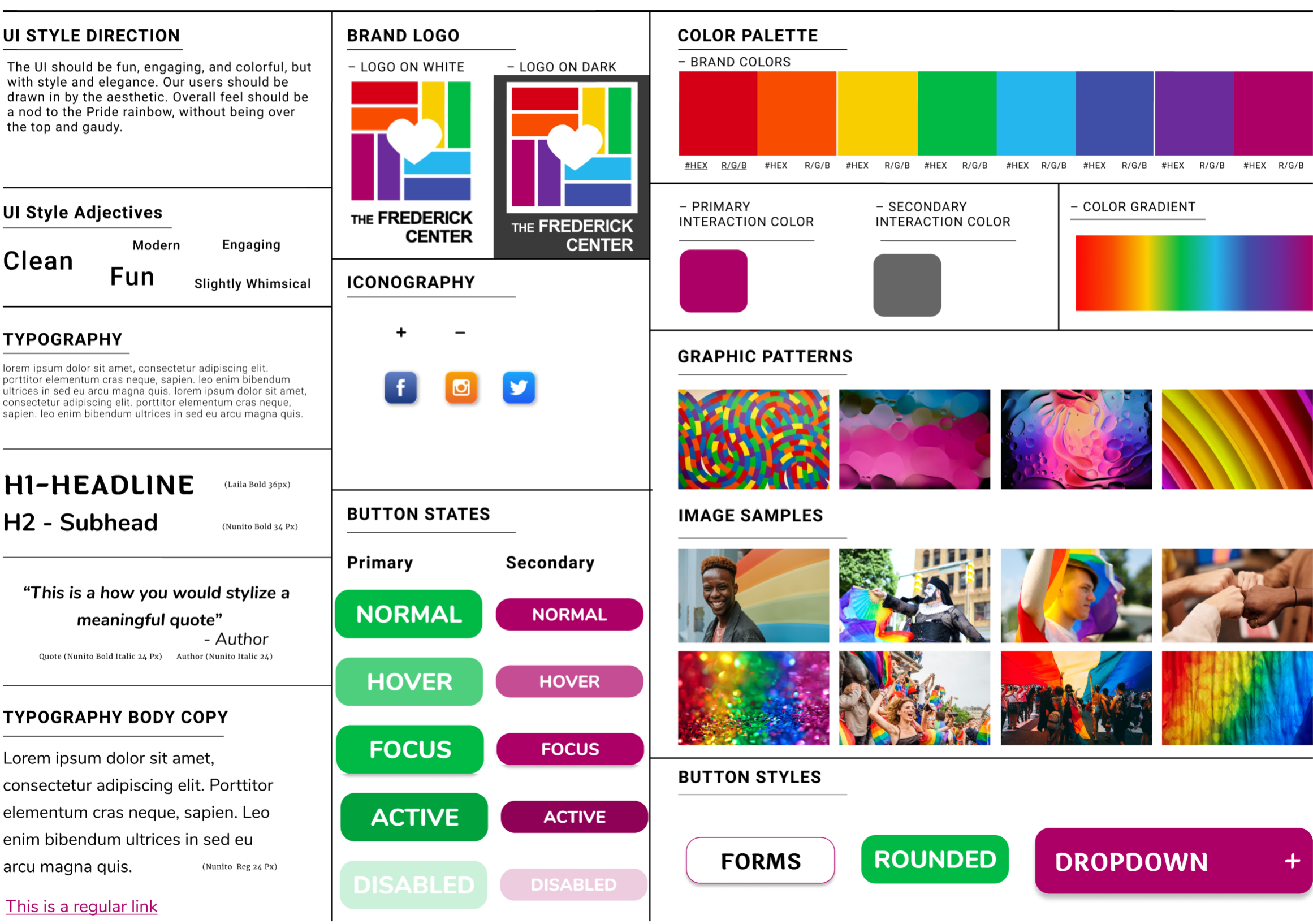
VISUAL DESIGN & STYLE GUIDEBACK TO TOP
Based on our initial user interviews, our other users wanted to interact with a website that spoke more to their community with intentional aesthetics, without being stereotypical. Our UI style guide provides the tools needed for the website revision. We gathered our ideas on an InVision mood board, then translated that inspiration into our style guide.
While the logo did not need a major overhaul, we did believe that the typography needed some refinement and we changed the square shaped negative space in the center to a heart shape to emphasize acceptance and community.
Because the logo already contained eight colors, we did not want to add more colors to the palette, nor did we feel that it was necessary to use all eight colors. We chose magenta because it is vibrant and spirited, just as the LGBTQ+ community is. To complement that, we chose green as a secondary color. The green plays well against the magenta and creates visual tension to make the sparing use of green truly stand out from the rest of the design. We chose to use gray as the only other color in regular use, so as not to overwhelm with color.
Our font choices are intended to add some whimsy and levity to the site, while being clean and modern. Knowing that LGBTQ+ is a series of capital letters, we were very intentional about the font and steered away from script fonts where that lockup of letters would not be visually engaging.
The photographic imagery we chose incorporates the full spectrum of lively and spirited colors contained in the logo, but does so without looking trite.
UI Style Tile
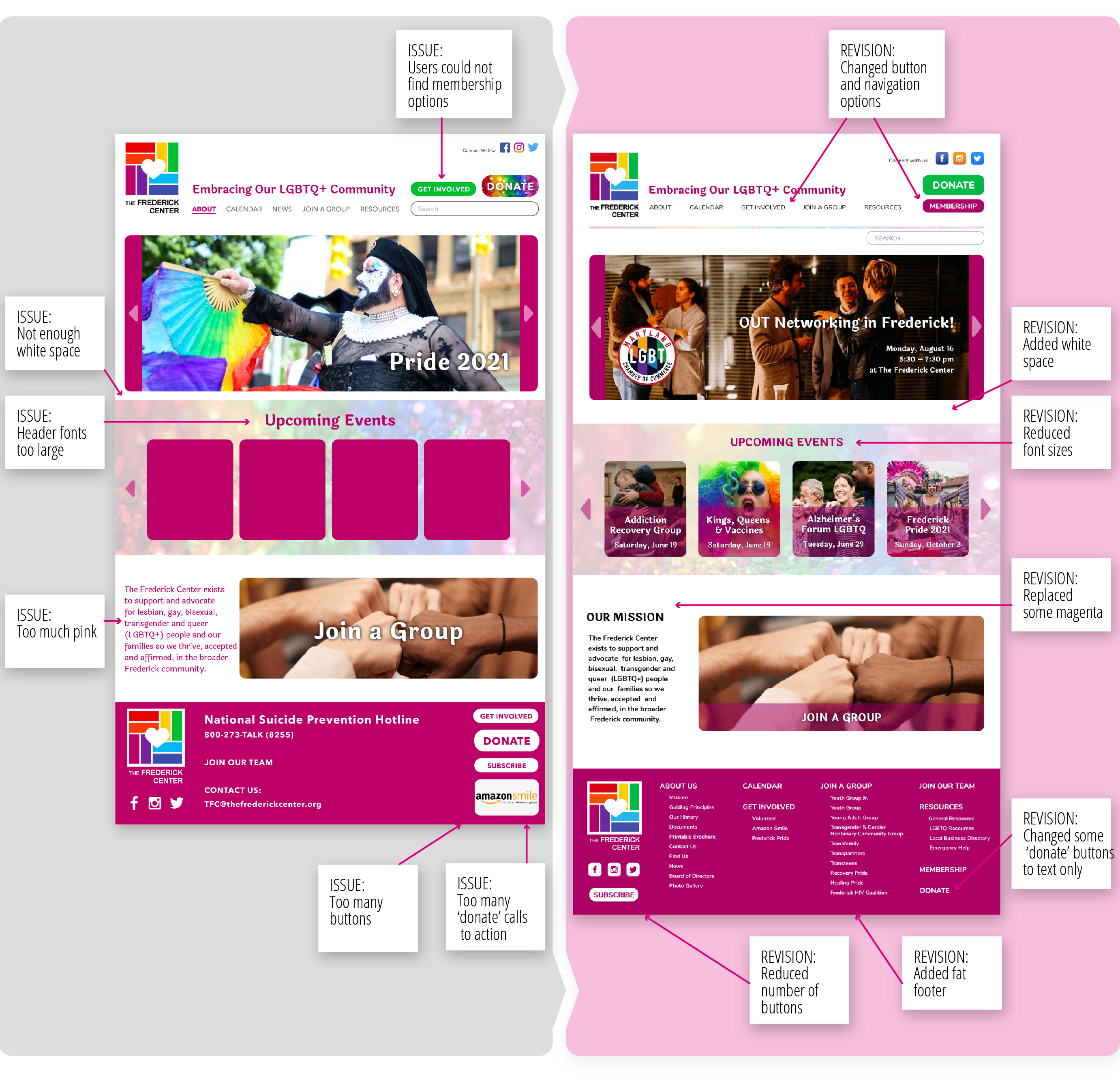
USER TESTING & OUTCOMESBACK TO TOP
Testing users enabled us to make iterations that were critical to the usability of our site.
Our key findings and subsequent actions from six user tests were:
- Header fonts were too large → reduced font sizes
- Users could not find membership options → changed ‘get involved’ button to ‘membership’ and added ‘get involved’ to main navigation
- Inconsistent and overwhelming navigation dropdown styles → added fat footer and removed dropdown menus
- Too many ‘donate’ calls to action → changed some of the ‘donate’ buttons to text only links, reducing the visual impact
- Too much pink → reduced the quantity of magenta used
- Not enough white space → gave the pages more breathing room
- Breadcrumbs were confused with navigation → moved breadcrumbs below a line to make them completely separate from the main navigation
- Too many buttons → changes some buttons to text only links
Revisions